- Time to Read:
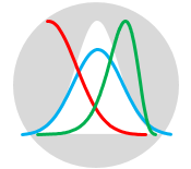
Also known as Frequency Distribution Diagram.
Related topics include Dot Plot and Pareto Chart.
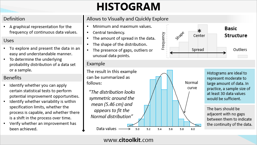
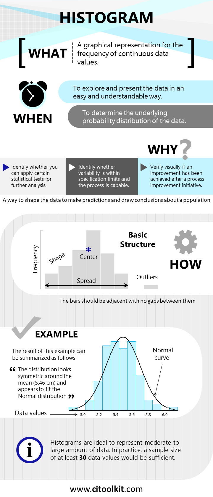
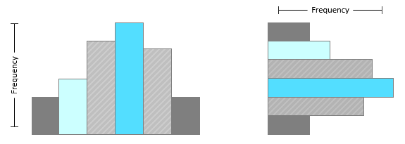
One of the best methods for analyzing any process involves the graphical representation of data through the utilization of graphs or charts. Among these graphical tools is the histogram, which is a graph that shows the frequency of continuous data values. It takes the form of a bar chart which can be drawn either vertically or horizontally. Histograms are widely used across diverse fields, including statistics, scientific research, economics, social and human sciences, and it is especially important in process improvement and operational excellence endeavors.
Histograms are mainly used to explore data as well as to present the data in an easy and understandable manner. They often serve as an initial step in determining the underlying probability distribution within a given dataset or sample. By visually representing the data, histograms enable to examine the probability distribution shape, central tendencies, the amount of variation in the data, as well as the presence of gaps, outliers, or unusual data points.
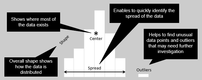
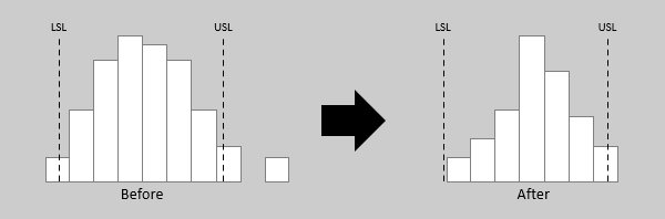
Histograms can be helpful to identify whether you can apply certain statistical tests to perform potential improvement opportunities. Additionally, they offer a means to validate the effectiveness of improvement initiatives by comparing histograms of data before and after the improvement initiative. Histograms can further assist in assessing whether data variability is within specification limits, whether the process is capable, and whether there is a shift in the process over time.
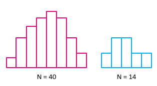
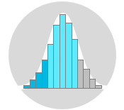
Histograms are ideal at representing moderate to large amount of data. In practice, a dataset of at least 30 data values is generally adequate for meaningful histogram construction. A histogram may not accurately display the distribution shape if the data size is too small. Dot plots are preferred over histograms when representing small amount of data.
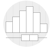
Constructing a Histogram Manually
There are many applications and online services that allow the creation of histograms quickly and automatically (such as Minitab). However, manual construction of histograms can be accomplished by following the steps outlined below:
- Collect the data set and prepare it for the analysis.
- Draw a horizontal line and divide it into equal intervals or bins (12 intervals for example). The total width should be equal to the range of the data.
- Draw bars above each bin to represent the frequency of the data values within each interval. The bars should be adjacent with no gaps between them.
- Indicate the mean of the data and other important information such as the standard deviation and the specification limits.
Note: Consider utilizing the provided Microsoft Excel histogram template as a convenient tool for this purpose.
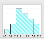
Example – Manufacturing Environment
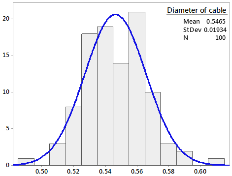
The following is a histogram that represents the distribution of cable diameters for a manufacturing process.
The result can be summarized using day to day language such as: “The distribution looks symmetric around the cable diameter mean (0.546 cm) and appears to fit the Normal Distribution fairly well”.
Example – Service Environment
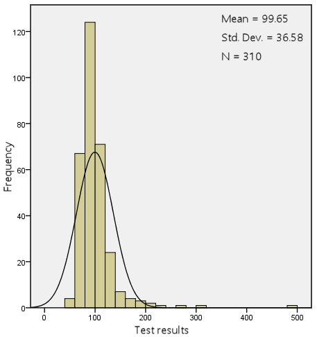
This histogram illustrates an analysis that was conducted for diagnosing the presence of diabetes at a workplace.
Note that the distribution of the data exhibits a right-skewed pattern. It looks more like an exponential distribution which is normal for this type of data.
There are many applications and online services that allow the creation of histograms quickly and automatically (such as Minitab). One of the simplest and most straightforward ways is to use this Microsoft Excel histogram template.
Wrapping Up
In conclusion, histograms are a valuable tool for analyzing and presenting data across diverse fields. They help explore data, identify probability distributions, and spot outliers. Histograms are particularly useful in process improvement and operational excellence efforts, where they help assessing data variability and process capability. They work best with moderate to large datasets, but for smaller datasets, consider using dot plots.
Other Formats
Do you want to use the slides in your training courses?
Histogram Training Material: $20.85
Related Articles
Related Templates


