- Time to Read:
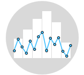
Histograms and box plots are graphical representations for the frequency of numeric data values. These visual tools serve the purpose of describing the data and exploring the central tendency and variability before using advanced statistical analysis techniques. In this article, we will further discuss the similarities and differences between these two tools.
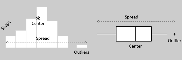
Both visual tools provide a visual means to assess the central tendency, the amount of variation in the data, as well as the presence of gaps, outliers or unusual data points.
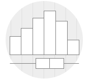
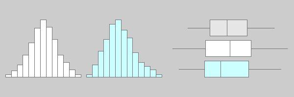
Both visual tools serve as effective tools for exploring and presenting data in an easy and understandable manner. Histograms are particularly useful in determining the underlying probability distribution of a dataset, while box plots are more useful when comparing between multiple datasets. They are less detailed than histograms and take up less space.
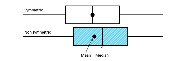
Although histograms are better in displaying the distribution of data, box plots can indicate whether the distribution is symmetrical or skewed. In a symmetrical distribution, the mean and median values are nearly the same, and the two whiskers has almost the same length.
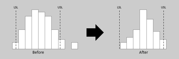
Both visual tools are valuable for assessing the impact of improvement initiatives by analyzing data before and after the intervention. Both tools can aid in identifying whether the variability remains within specification limits, whether the process is capable, and whether there are potential shifts in the process over time.
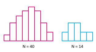
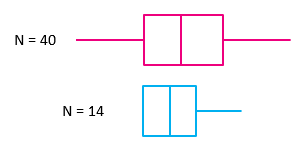
Both visual tools are ideal for presenting moderate to large datasets. However, they may not accurately display the shape of the distribution if the data size is too small. In practical terms, a sample size of at least 30 data values is considered adequate for both tools.
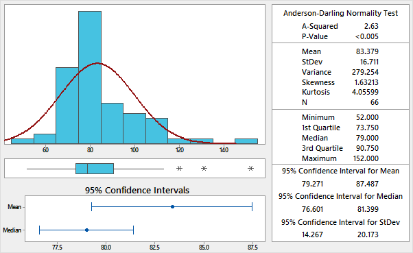
Many statistical applications offer the option of visually summarizing data, including plotting data on histograms and box plots, as illustrated below. This approach can reveal unusual observations in the data that should be investigated prior to conducting detailed statistical analysis.
Wrapping Up
Histograms and box plots are very similar in their ability to visualize and describe numeric data. Although histograms are better in determining the underlying distribution of the data, box plots allow the comparison of multiple datasets as they are less detailed and take up less space. It is recommended that you plot your data graphically before proceeding with further statistical analysis.
Related Articles