Continuous Improvement Toolkit
Effective
Tools
for Business and Life!
Search
Libraries
Articles
Templates
Slides
Posters
Infographics
Examples
Exercises
Maps
CI Map
Lean Tools Guide
Yellow Belt Guide
Green Belt Guide
Black Belt Guide
PMBOK Tools
Change Tools
DMAIC Process Guide
Basic Quality Tools
Blog
Shop
Category:
Cause and Effect Analysis
Complexity is Made Simple Through Interrelationship Diagrams
A Comprehensive Guide to Relationship Mapping
The 5W1H Approach: Asking Simple Questions for Great Results
Enhancing Decision Quality with Matrix Diagrams
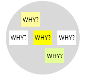
Beyond the Five Whys: Exploring the Hierarchical Causes with the Why-Why Diagram
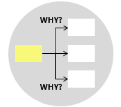
Unlocking Insights and Driving Solutions Using the 5 Whys Approach
A3 Thinking: A Structured Approach to Problem Solving
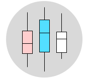
The Role of Box Plots in Comparing Multiple Data Sets
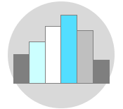
The Role of Histograms in Exploring Data Insights
Graphical Analysis
Normal Distribution
Probability Distributions
Next Page
→