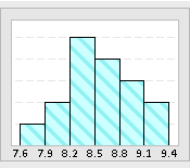
A histogram is a bar chart used to show how data is distributed. It provides insights into the central tendency of the data and the degree of variability presented in the process. This histogram template is designed to enter up to 100 individual data points, and a histogram will be displayed automatically reflecting the data. The more data you have, the more accurate the histogram will be.
This customizable template runs in Excel, and you can modify it to fit your specific needs. For example, you may want to add additional data rows if your dataset exceeds the 100 data point limit. You may also add additional functionality to the worksheet such as adjusting the number of bins, displaying the specification limits, or calculating and displaying capability indices such as Cp and Cpk.
In addition to presenting the histogram, this template will automatically generate a summary of descriptive statistics related to the data such as the mean, median and standard deviation. However, it’s important to note that this template is primarily designed for individuals who are relatively new to statistical analysis. For more complex and in-depth data exploration and statistical analysis, it is advisable to leverage advanced software solutions like Minitab.
Histogram Template (32 KB)
Histogram Template Examples (44 KB)
Related Templates


