- Time to Read:
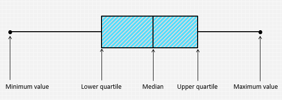
Also known as Box-and-Whisker Plot and Whisker Plot.
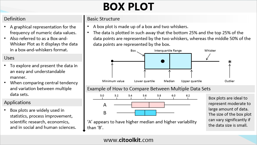
A box plot is a graphical representation that shows the frequency of numeric data values. It is mainly used for exploring data patterns as well as to present the data in an easy and understandable manner. Box plots are one of the easiest and most useful ways to understand and compare continuous data sets. They are widely used in fields such as statistics, scientific research, higher education, social and human sciences, as well as process improvement and operational excellence endeavors.
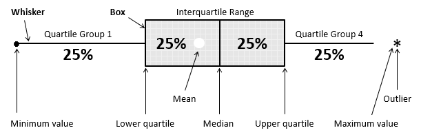
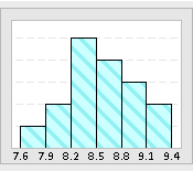
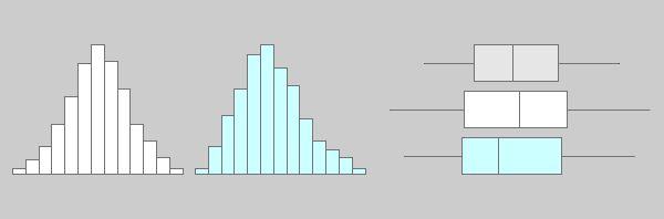
Box plots share similarities with histograms and provide similar information but in different graphical format. Plotting the data using box plots allows the examination of many characteristics of the data. They provide a quick way for examining the central tendencies, the amount of variation in the data, as well as the presence of gaps, outliers1, or unusual data points. For instance, a wider range within a box plot indicates greater variability.
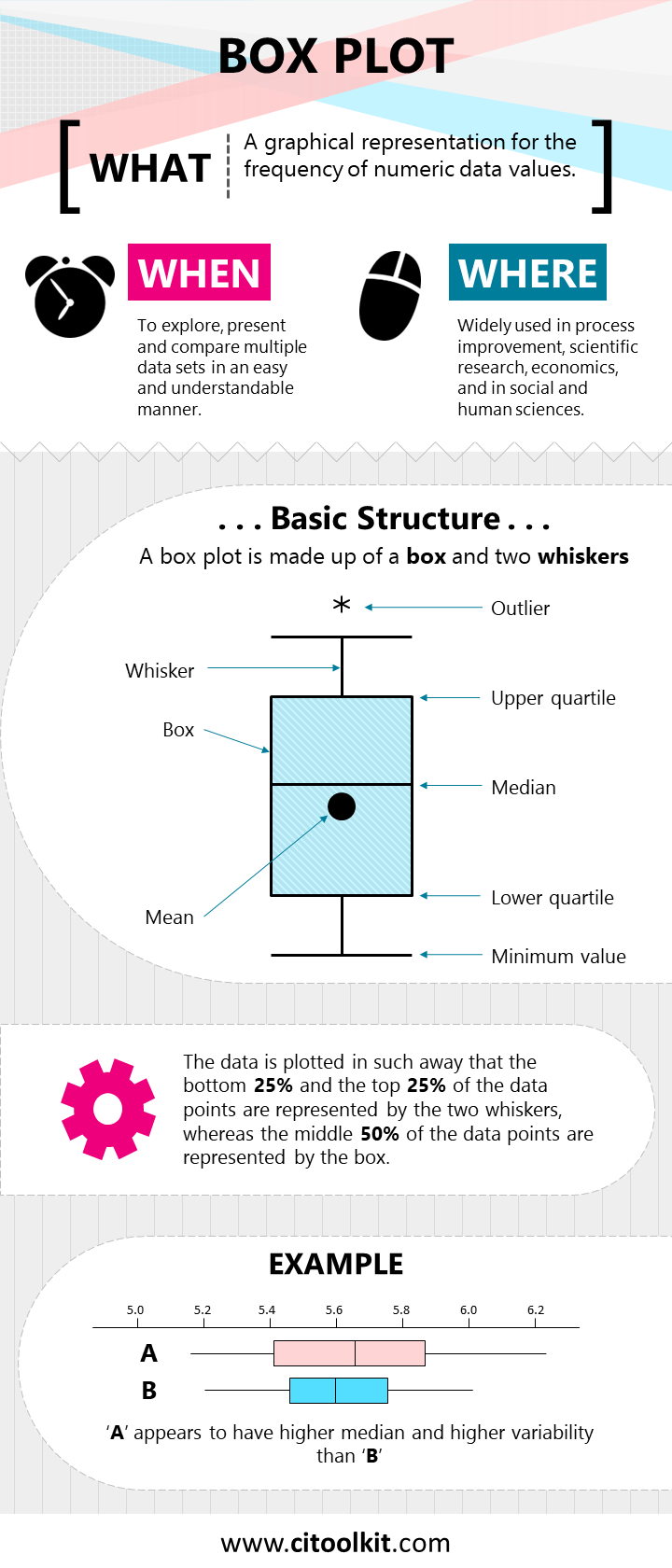
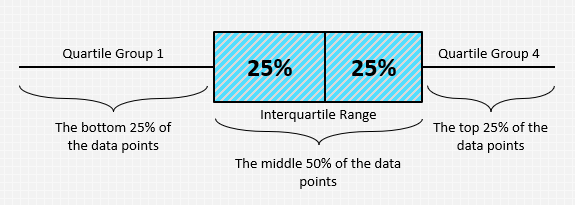
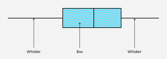
In a box plot, data is graphically plotted such that the lowest 25% and the highest 25% of the data points are represented by the two whiskers, while the middle 50% of the data points are represented within the central box. Key statistical measures can be indicated including the median of the data, maximum and minimum values, and the lower and upper quartiles. Outliers are usually denoted as asterisks.
Box Plots for Data Comparison
Box plots are most useful when comparing between multiple data sets, allowing to compare their central tendencies and variabilities. They have the advantage of being less detailed than histograms and take up less space which make them more practical for conducting comparisons. Subsequently, more advanced statistical tests can be conducted to test the significance of the differences in terms of central tendency and variability.
Like histograms, box plots are ideal in representing moderate to large amount of data. Their size may significantly vary with smaller datasets. Individual value plots are preferred over box plots when representing small amount of data.
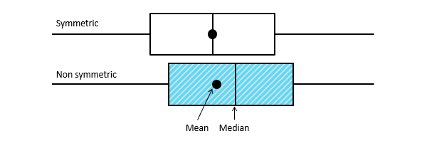
They can also tell whether a distribution is symmetrical or skewed. In a symmetric distribution, the mean and median are nearly the same, and the two whiskers exhibit nearly identical lengths.
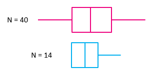
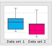
Example – Crop Yield
The following box plots display the yield of a crop resulting from the application of two different fertilizers.
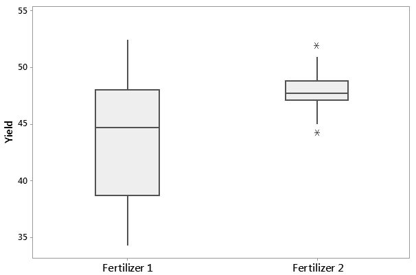
Fertilizer #2 appears to yield higher crop yields than Fertilizer #1. What other comments would you make about the above box plots? Think about the variation as well as the presence of any unusual values or outliers.
Example – Diabetes Test
The below example illustrates an analysis that was conducted for diagnosing the presence of diabetes at a workplace.
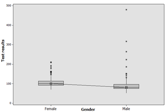
It is evident that females have in general higher glucose levels than males. To confirm the statistical significance of this difference, an analysis of variance (ANOVA) can be applied to compare the means between the two groups.
There are many applications and online services that allow the creation of box plots quickly and automatically (such as Minitab). One of the simplest and most straightforward ways is to use this Microsoft Excel box plot template.
Wrapping Up
Box plots are graphical representations that show the frequency of numeric data values. They efficiently display central tendencies and data variability, and are ideal for comparing multiple data sets. They work best with moderate to large datasets. In short, box plots offer valuable insights when analyzing the data and support advanced statistical tests.
- An outlier is a data point that is significantly greater or smaller than other data points in a data set. ↩︎
Other Formats
Do you want to use the slides in your training courses?
Box Plot Training Material: $15.85
Related Articles

Related Templates


