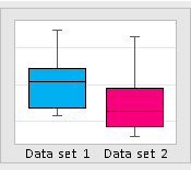
A box plot is a graphical representation that illustrates the frequency of numeric data values for a given variable. This visualization indicates where most of the data is grouped and how much variation there is in the data. Box plots are particularly useful when comparing between multiple data sets. This box plot template allows to enter up to 70 data points for two data sets, and the box plots will be displayed automatically to reflect the data.
This customizable template runs in Microsoft Excel, and you can modify it to fit your specific requirements. For example, you may add additional data grids if your datasets contain more than 70 data values. Moreover, you can have additional datasets as needed if the study involves more than two sets of data.
In addition to displaying the box plots, the template also provides a summary of descriptive statistics related to the entered data such as mean and standard deviation. Note that this template is limited and intended to be used by individuals new to statistical analysis. For more advanced analyses, it is recommended to leverage advanced statistical applications like Minitab.
Box Plot Template (28 KB)
Box Plot Template Example (32 KB)
Related Templates


