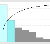
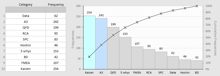
The purpose of the Pareto chart is to address the most significant elements within a given set, such as the highest occurring type of defect, the most frequent reasons for customer complaints, and so on. It normally combines an ordered bar chart and a line chart. The items on the left side of the chart are called the “vital few” representing the most impactful elements, while the rest are categorized as the “trivial many”.
This Pareto chart template comes in three different variations. The first variant is used when you have data that has been summed up or aggregated. The other two are designed for recording daily data on a weekly or monthly basis. After data collection using a printed form or a check sheet, the next step involves entering the data into the provided worksheet. If you find in the resulted chart a Pareto pattern, this suggests that only few causes account for about 80% of the effect.
This template is a Microsoft Excel document that you can use and modify to align with your specific requirements. It can easily be modified to include additional sections as needed. For example, you may want to add additional rows to the worksheet to show more elements or categories. If you are looking for more advanced Pareto analyses, it’s recommended to use specialized tools like Minitab.
Pareto Chart (28 KB)
Pareto Chart Template Example (32 KB)
Pareto Chart – Weekly Data (32 KB)
Pareto Chart – Monthly Data (32 KB)
Related Templates


