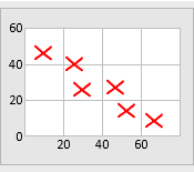
A scatter diagram is a graph that facilitates the visualization of the relationship between two variables. Its primary purpose is to check if changes in one variable are associated with changes in the other variable. For example, a scatter diagram can be plotted to assess the potential correlation between the duration of employment and the years of professional experience.
This scatter diagram template enables to enter two sets of data and the scatter diagram will be displayed automatically. Beyond this graphical representation, the worksheet will conduct a Pearson’s coefficient correlation test to determine the strength of the association between the two data sets. Care should be taken, however, that this testing for correlation does not imply that there is a cause-and-effect relationship between the two variables.
This template runs in Excel, and you can modify it to align with specific analytical needs. For example, you may want to add additional rows if you want to include more data in the test. You may also redesign the template to allow for data stratification if needed. This is particularly useful when considering different settings for the input variable.
Scatter Diagram Template (28 KB)
Scatter Diagram Template Example (28 KB)
Related Templates


