- Time to Read:
Also known as Time Value Chart.
Related topics include Value Stream Timeline.
A time value map is a graphical representation of the value-added and non-value-added time within a business process. It focuses on what adds value to a business process as perceived by the customer. The primary objective is to enhance process efficiency while maximizing customer value perception. This tool is an integral component of the Lean methodology, serving to facilitate the identification and analysis of waste and non-value-added activities within any operation.
This tool is mainly used to monitor and evaluate the extent of wasted time from the start of the process until the final delivery of a product or service. It allows for the identification of time-related waste, particularly in terms of waiting periods and unnecessary delays. An in-depth examination of the duration required to complete each activity within a process is necessary. This involves capturing data on processing (or touch) time, queue (or waiting) time, idle time, inspection time, among others. This information can be obtained from the timeline of the value stream map or after conducting a process chart exercise.
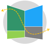
Each activity within a process can be categorized into one of three categories:
Value added activities – Refers to the activities that increase the worth of a product or service from the customer’s perspective.
Essential non-value-added activities – These activities do not add value that customers are willing to pay for. However, they are necessary due to current process settings.
Non-value-added activities – These activities do not provide any value to the product or service and are not required for business operational reasons.
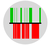
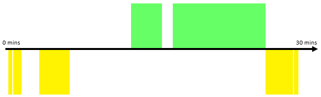
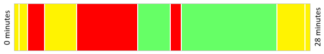
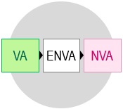
In a time value map, all activities are plotted as bars proportional to their time values along a horizontal timeline. Value-adding activities are positioned above the timeline, while non-value-adding activities are placed below it. You may use the traffic light colors to enhance the clarity of the map.
Creating a Time Value Map
The following are key steps involved in creating a time value map:
- Make sure everyone is clear on what process to analyze.
- Draw the process timeline at the center of a whiteboard or flipchart.
- Specify the start and end times, total cycle time, cycle time intervals, and the queue times between activities.
- Draw bars to represent the value-added activities time above the timeline.
- Draw bars to represent the non-value-added activities time below the timeline.
- Calculate the total value-added time, total non-value-added time, and value stream ratio.
- Implement projects and systems to eliminate or reduce the non-value-added activities and decrease the overall waiting time.
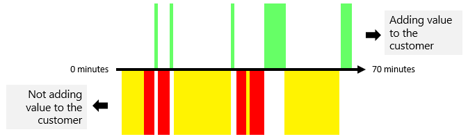
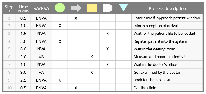
Example – Patient Flow Process
In the following example, we will analyze and document the time taken to perform each activity within the patient flow process at a clinic. The process begins when the patient arrives at the clinic and ends upon their departure. It is important to note that the time information presented here has been obtained through a process chart exercise.
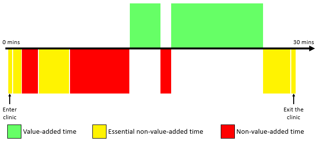
Note that delays, waiting and idle time could be represented as blank spaces or gaps between the bars.
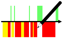
A time value map can also be represented in the following format where all bars are parallel to each other.
Later on and when you better understand the process, some activities should become obvious candidates for elimination or modification.
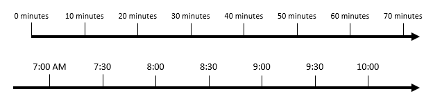
Note that the scale of the timeline can be represented using intervals of the cycle time (in seconds, minutes, hours, etc.) or by considering the actual time of a day.
There are many tools available to assist in creating a time value map. One of the simplest and most straightforward approaches includes utilizing this time value map template.
Wrapping Up
A time value map is a Lean tool that helps businesses improve efficiency and customer value. It categorizes activities into value-added, essential non-value-added, and non-value-added, facilitating waste identification. It visually represents activities on a timeline, with value-adding activities above and non-value-adding activities below the timeline, often using traffic light colors to enhance the clarity of the map.
Other Formats
Do you want to use the slides in your training courses?
Time Value Map Training Material: $15.85
Related Articles

Related Templates


