- Time to Read:
Also known as The Law of the Vital Few and The 80/20 principle.
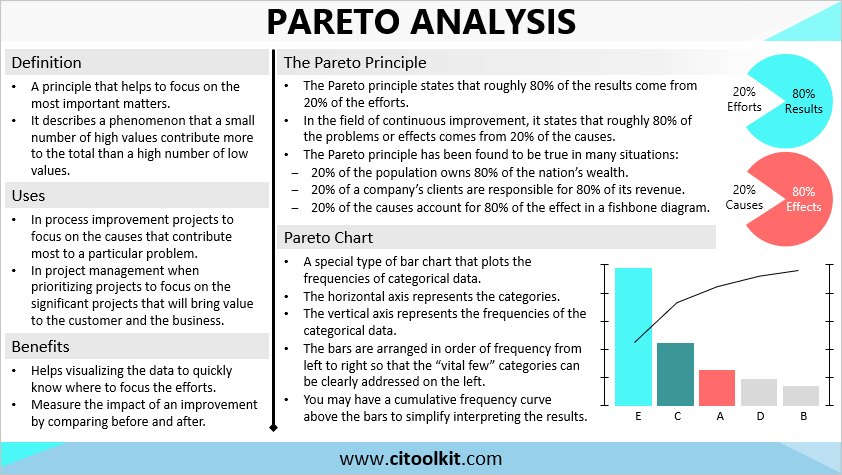
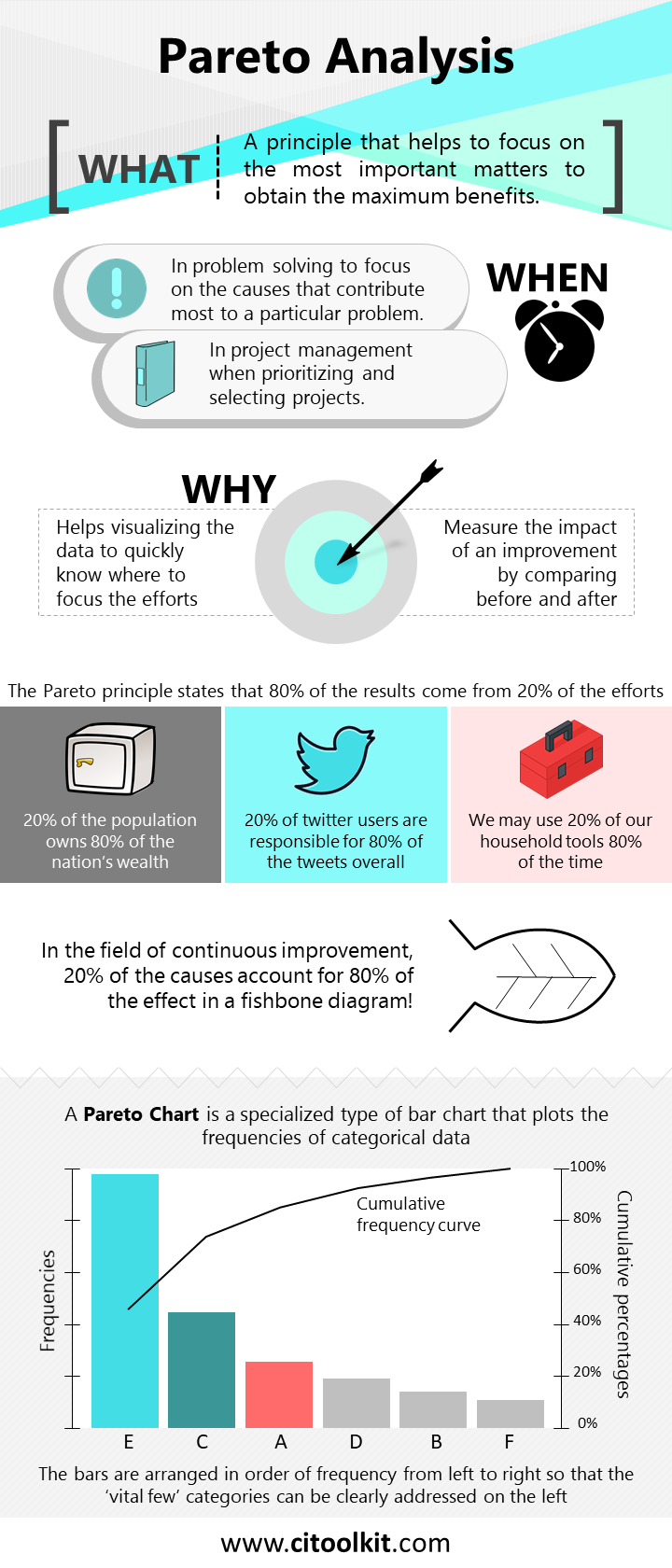
The Pareto principle, also known as the 80/20 rule, is a guiding principle that helps to focus on the most important matters. It describes a phenomenon that a small number of high value elements contribute more to the overall outcome than a high number of low value elements. The main idea behind this principle is to identify the “vital few” from the “trivial many” in order to focus efforts and maximize benefits. Pareto analysis is one of the seven basic tools of quality, and considered one of the key tools in Six Sigma and Total Quality Management.
According to the Pareto principle, approximately 80 percent of the results are derived from around 20 percent of the efforts. And in the field of continuous improvement, this principle states that roughly 80 percent of the problems or effects arise from approximately 20 percent of the causes. It is important to note that the specific percentages may vary depending on the particular situation. However, it is commonly observed that few efforts are usually responsible for most of the results, and few causes are usually responsible for most of the effects.
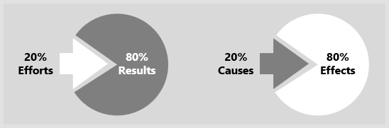
The Pareto principle has been found to be true across various fields and scenarios. For instance, approximately 20 percent of a company’s clients generate around 80 percent of its revenue. Similarly, approximately 20 percent of the population tends to own around 80 percent of a nation’s wealth. In the field of social media, the most active 20 percent of Twitter users are responsible for approximately 80 percent of the overall tweets. Similarly, just a few causes account for most of the effect in a fishbone diagram. We can also find examples in our personal lives, such as that we are using approximately 20 percent of our household tools for approximately 80 percent of the time.
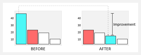
The Pareto principle serves as a useful framework for assessing the impact of improvements by comparing the before and after states. Analyzing the new Pareto chart allows for the confirmation of the achieved improvement.
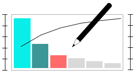
Pareto Chart
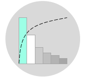
A Pareto chart is a specialized type of bar chart that plots the frequencies of categorical data. In this chart, the horizontal axis represents the categorical data, while the vertical axis represents the corresponding frequencies. The bars are arranged in descending order of frequency from left to right, thereby addressing the vital few categories on the leftmost side.

Optionally, a cumulative frequency curve can be included above the bars, accompanied by a right vertical axis representing cumulative percentages. This facilitates the interpretation of results and enables a clearer understanding of the 80/20 relationship. Additionally, if there are many categories with low and infrequent occurrences, you may group them under an “Other” category that is positioned at the rightmost bar.
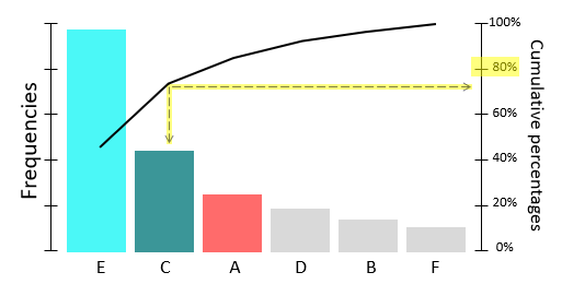
If the resulted Pareto chart clearly illustrates a Pareto pattern, it suggests that a small number of causes account for approximately 80 percent of the problem. This observation indicates the presence of a Pareto effect, and you can focus your efforts on tackling these key causes. However, if no Pareto pattern is found, we cannot say that some causes are more important than others. It is important to ensure that the Pareto chart contains a sufficient amount of meaningful data to draw valid conclusions.
Constructing a Pareto Chart
The following are key steps involved in constructing a Pareto chart:
- With your team, define the problem and identify the possible causes (using brainstorming for example).
- Collect the categorical data to be analyzed.
- Calculate the frequencies of the categorical data.
- Draw a vertical line on the left of the chart to place the frequencies.
- Draw a horizontal line and place vertical bars above it to indicate the frequencies of the categories.
- Sort the categories in order of frequency of occurrence with the largest on the left.
- Calculate then draw the cumulative frequency curve and the cumulative percentage line.
- Label the chart with a title and any other necessary information such as the date and the source of the data used.
- If you observe a Pareto effect, focus your improvement efforts on those few categories whose vertical bars account for most.
Example
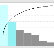
A factory team has gathered and created a Pareto chart with the intention of addressing the escalating number of customer complaints in a manner that can be comprehended by management.
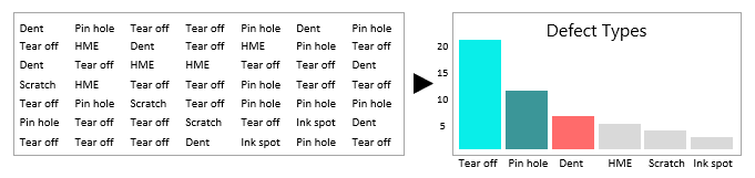
Note how the chart aids in visually representing the data, thereby facilitating a better understanding of the focal areas.
Example
A team within the hospital has collected data to investigate the increased number of call bell usage by patients, with the ultimate goal of enhancing nursing services.
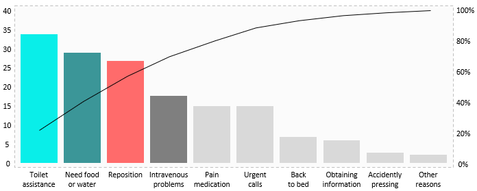
The Pareto effect is evident to a certain extent in this scenario. The initial four factors, which account for 40 percent, contribute to approximately 70 percent of the observed impact, as indicated by the cumulative frequency curve.
Consider combining similar categories when possible. For instance, combining “toilet assistance” and “back to bed” under a single category is a viable option.
Example
A factory team has collected data to address the rising number of customer complaints. Note that the main categories are too generic.
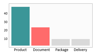
The Pareto chart has further been analyzed and the main categories where specific problems occur most often have been sub-categorized.
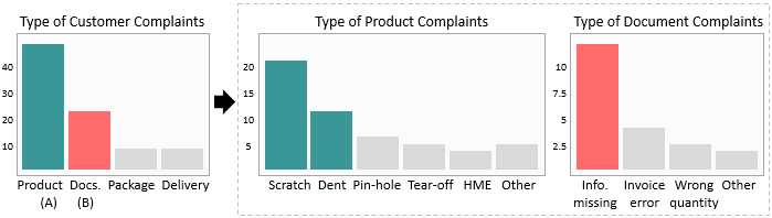
The findings suggest that there are three sub-categories that exhibit the highest frequency of occurrence.
There are many tools available to assist in constructing a Pareto chart. One of the simplest and most straightforward approaches includes utilizing this Pareto Chart Template.
Wrapping Up
Decision makers often use Pareto analysis to identify the most significant efforts and prioritize them accordingly. This tool is also useful in process improvement initiatives to focus on the causes and factors that contribute most to a particular problem. Moreover, Pareto analysis can be useful in project management, aiding in the prioritization of projects that bring significant value to both customers and the overall business.
Other Formats
Do you want to use the slides in your training courses?
Pareto Analysis Training Material: $20.85
Related Articles


Related Templates