- Time to Read:
Also known as Ishikawa Diagram, Cause and Effect Diagram and Fishbone Analysis.
Related topics include Tree Diagram.
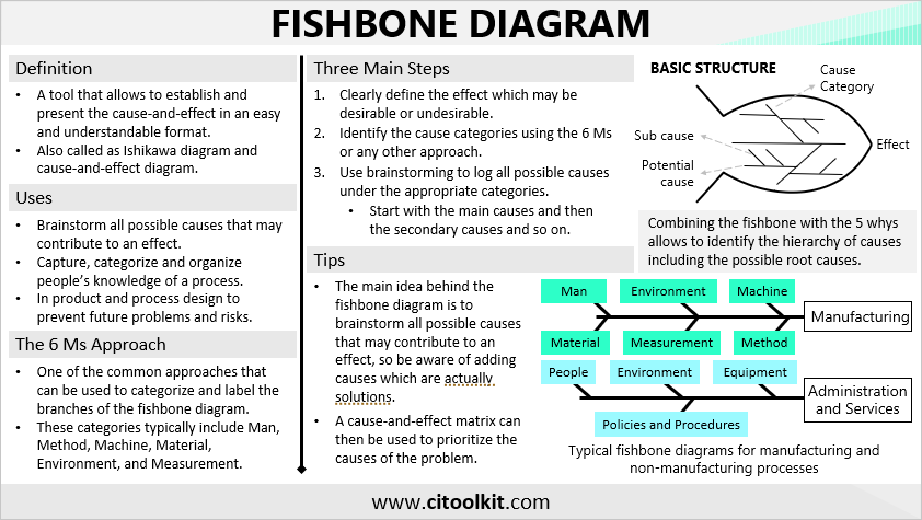
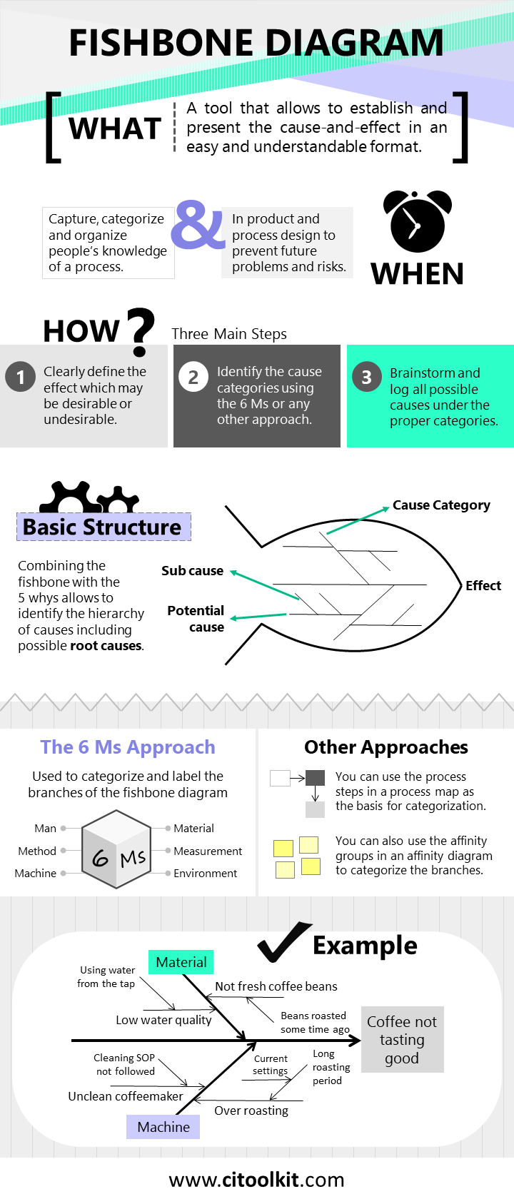
A fishbone diagram is one of the various techniques available for conducting cause-and-effect analyses. It provides a structured way to identify and organize the potential causes contributing to a particular problem or effect. It allows the establishment and presentation of causal relationships in a straightforward and understandable format. The word fishbone comes from its visual representation that looks like the skeleton of a fish.
The fishbone diagram is one of the seven basic tools of quality and considered one of the fundamental tools in the domain of quality management. Its primary function lies in the identification of root causes underlying a specific effect in order to identify an appropriate solution that can be effective. This technique often used in Lean Six Sigma and other quality improvement methodologies to narrow down the area of analysis. The outcome of a fishbone analysis provides useful information for later problem-solving tools.
The fishbone analysis can also be effectively used in product and process design, as well as a cause prevention tool to prevent future problems and risks.
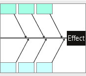
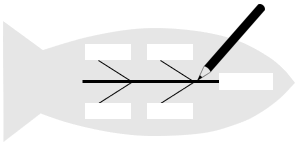
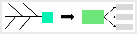
The first step in conducting a fishbone analysis is to clearly define the effect. This effect could be a quality issue, a technical complication, or simply not meeting a performance target. In the fishbone diagram, the effect is placed at the head of the fishbone while the causes are placed on the branches. For easier sharing and reference, it is important to categorize causes. Numerous categorization approaches are available, including the well-known 6 Ms which will be discussed in further detail.
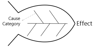
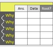
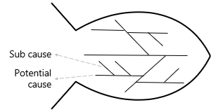
Combining the fishbone technique with the 5 whys technique gives the analysis an extra dimension. This allows to identify the hierarchy of causes including the possible root causes. Root causes typically represent those factors at the ends of the chains of causes that do not have any sub-causes. It is important to note that the main idea behind the fishbone analysis is to brainstorm all possible causes that may contribute to an effect, so be aware of brainstorming and adding causes which are actually solutions.
The 6 Ms Approach
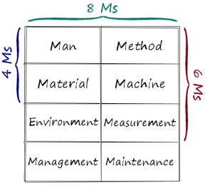
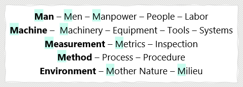
The 6 Ms is a widely adopted approach for categorizing potential causes and assigning labels to different branches on the fishbone diagram. This approach finds application in manufacturing, production, and service industries. The typical six categories it includes are Man, Method, Machine, Material, Environment, and Measurement.
Man – Anyone involved with the process and contributes to the effect including governance and support functions.
Method – How the process is performed and the specific requirements for doing it including policies, procedures and common practices.
Machine – The machinery, equipment and tools required to produce a product or deliver a service.
Material – All the materials needed to perform a process including raw materials, packaging, paperwork and information.
Environment – The conditions in which the process operates including the weather condition, geographical location and cultural aspects.
Measurement – The data and metrics that are used to evaluate the performance of the process.
There are many other categorization approaches that might be worth considering. For example, the 8 Ms approach adds Management and Maintenance to the 6 Ms categories. Alternatively, when the effect results from a documented or mapped process, the process steps themselves can form the basis for categorization. In such cases, the process input variables can be considered to be the potential causes.
It’s important to mention that the names used for categorizing causes can change depending on the situation or based on the user’s selection.
Conducting the Analysis and Drawing the Fishbone
Fishbone analysis is a collaborative exercise, fostering the capture, categorization, and organization of the collective knowledge held by a team regarding a problem or process. By going through the steps of drawing the diagram with your team, everyone gains insight into the cause-and-effect, which makes the solution easier to find.
- With your team, clearly define the effect that you want to work on.
- Write the effect statement in a box at the center right of a large piece of paper.
- Draw a long horizontal line pointing to the box.
- Identify the cause categories using the 6 Ms or any other approach.
- Write them in boxes parallel to the horizontal line.
- Use brainstorming to log all possible causes under the appropriate categories. Start with the main causes then the secondary causes and so on.
- Update the chart as new potential causes become apparent.
- Highlight or assign numbers near to the key causes to show their relative importance.
- If necessary, collect data to confirm key causes are real.
Note: A cause-and-effect matrix can be used to prioritize the identified causes of a problem. Prioritizing and selecting the key causes will minimizes the need for more statistical analysis of inputs with limited impact on the final output.
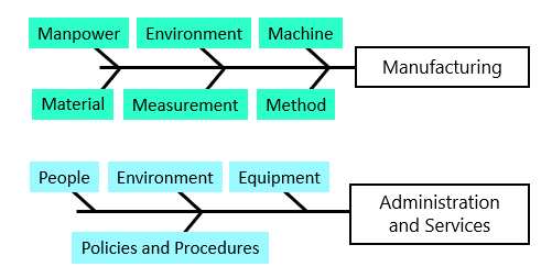
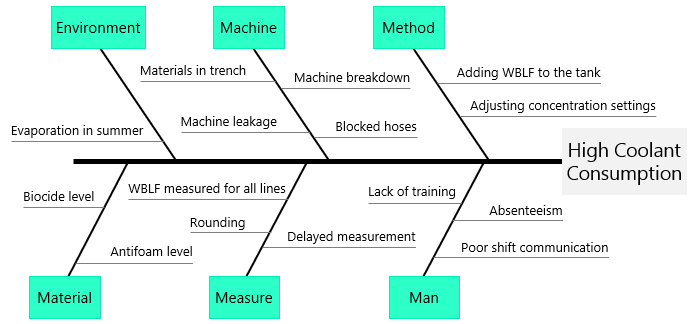
Example – Manufacturing
The example shown here represents the output of a brainstorming session on the causes of the increased coolant consumption within a manufacturing plant. Note that this fishbone diagram is labeled using the 6 Ms categorization approach.
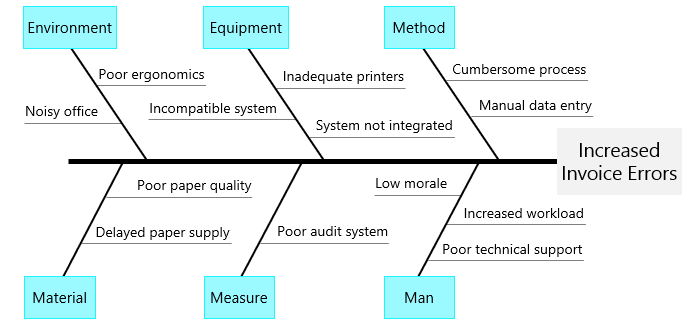
Example – Non-Manufacturing
The example shown here is the output of a brainstorming session on the causes of the increased invoice errors within a particular company. It is important to note that only the main causes have been displayed in this diagram.
Example – Fishbone Combined with 5 Whys
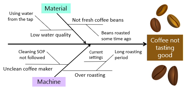
A restaurant manager has noticed an increase in the number of customer complaints regarding the flavor of the coffee served. In response, his team has constructed a fishbone diagram, incorporating potential causes and their respective sub-causes for only two categories.
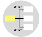
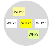
Another way of highlighting the structure of the possible causes is to use the why-why diagram.
There are many tools that can be used to identify and present a cause-and-effect relationship using the fishbone diagram. One of the simplest and most straightforward ways is using this fishbone diagram template.
Wrapping Up
The fishbone diagram is a valuable tool for conducting cause-and-effect analyses. It offers a structured approach to identify and organize potential problem causes. This tool is considered one of the fundamental tools in Lean Six Sigma and other quality improvement methodologies. Combining the fishbone diagram with the 5 Whys technique adds depth to the analysis and helps revealing the main causes and potential root causes. The outcome of a fishbone analysis provides useful information for later problem-solving tools.
Other Formats
Do you want to use the slides in your training courses?
Fishbone Diagram Training Material: $20.85
Related Articles
Related Templates