- Time to Read:
Also known as Scatter Plot and Scattergram.
Related topics include Matrix Plot.
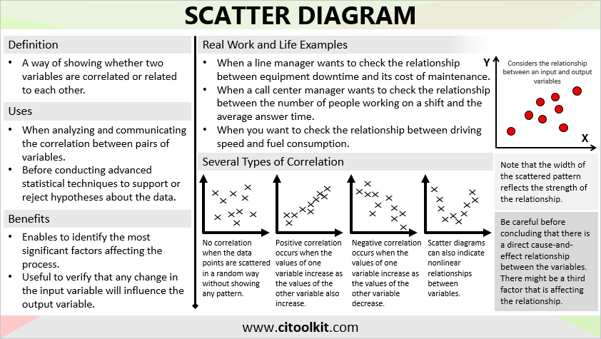
Many situations require the investigating of potential relationships among two or more variables. For example, a line manager may wish to assess the correlation between the number of training hours and employee productivity. Another example is when a call center manager seeks to examine the relationship between the number of people working on a shift and the average response time to clients. Also, when a restaurant owner wants to investigate the relationship between the hours of operation and the daily revenue generated.
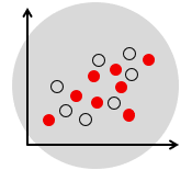
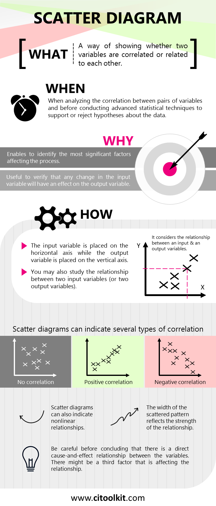
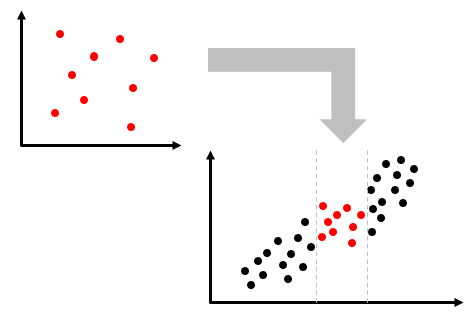
A Scatter Diagram serves as a valuable tool for assessing the potential correlation or association between two variables. It reveals patterns within the relationship that cannot be seen by just looking at the data. Moreover, it serves as an initial step in the analysis of variable pairs, and before conducting more advanced statistical techniques such as regression to support or reject hypotheses about the data.
The primary objective of a scatter diagram is to visually explore the relationship between two variables, typically an input and an output variable. This exploration helps confirm that alterations in the input variable have an impact on the output variable. This information aids in the identification of the most influential factors affecting a process or causing an effect, allowing non-critical factors to be excluded from consideration.
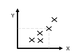
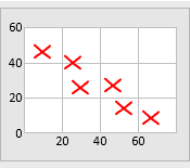
A scatter diagram uses a two-axis chart to represent data. The input variable is plotted along the horizontal axis (x-axis) while the output variable is plotted along the vertical axis (y-axis). It is also possible to examine the relationship between two input or output variables. In such cases, it doesn’t matter which variable is placed on which axis. It is worth noting that scatter diagrams are applicable to both continuous and count (discrete) data.
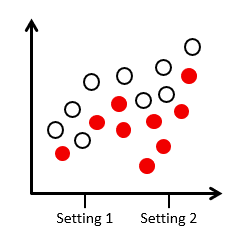
A stratification factor can also be illustrated on the scatter diagram. For example, the relationship between a process output and a process input for two different settings or categories.
Types of Correlation
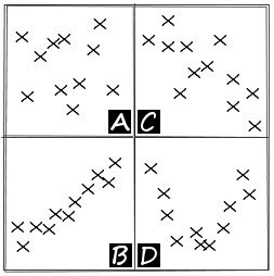
Scatter diagrams can indicate several types of correlation:
- There may be no correlation at all when the data points are scattered randomly without showing any particular pattern.
- Positive correlation occurs when the values of one variable increase as the values of the other variable increase.
- Negative correlation occurs when the values of one variable increase as the values of the other variable decrease.
- Scatter diagrams can also indicate nonlinear relationships between variables.
Caution should be taken before drawing conclusions about a direct cause-and-effect relationship between variables, as there might be a third factor that is affecting the observed relationship. Conversely, the absence of correlation does not necessarily mean there is no cause-and-effect relationship between variables. There might be a relationship over a wider range of data or a different portion of the range.
When the relationship is not so clear, correlation analysis can be used to help determine whether a relationship exists between the variables. Regression techniques take the analysis a step further by mathematically defining the relationship.
Constructing a Scatter Diagram
The following outlines the steps for constructing a scatter diagram.
- Collect the two paired sets of data.
- Once you have collected enough data points, create a summary table of the data.
- Draw and label the horizontal and vertical axes with variable names and scale values.
- Plot the data pairs on the diagram by placing a dot at the intersection of each data pair.
- Look at how the pattern appears and how the two variables vary together.
Example
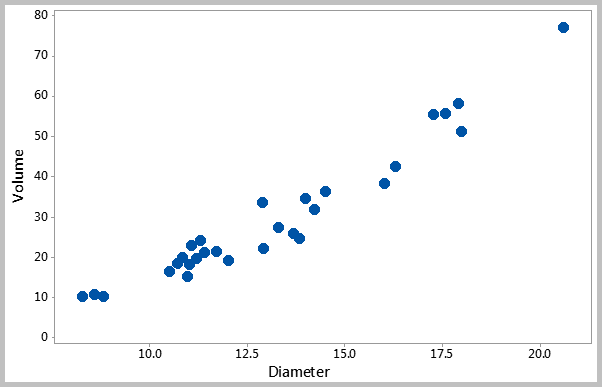
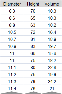
The following is an analysis that shows the relationship between the volume and the diameter of sample trees in a forest (see sample data). The scatter diagram strongly suggests a correlation between the two variables.
Example – Service Environment
The following is an analysis that was conducted for diagnosing the presence of diabetes within a workplace (see sample data). The population was generally young (75.8% under the age of thirty).
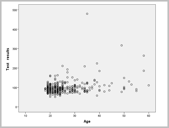
The scatter diagram does not reveal an obvious relationship between age and glucose levels. High glucose levels are observed across all age groups, and normal glucose levels are observed in older age groups.
Matrix Plot
A Matrix Plot is a useful tool for summarizing relationships between multiple pairs of variables in a single graph. It generates scatter diagrams for all possible combinations of variables. Potential correlations between pairs of variables can then be identified.
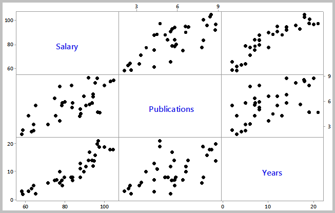
Example
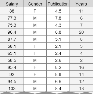
The following matrix plot example compares three variables to each other. It appears that there is a positive relationship between the years of experience and salaries. However, the number of publications does not appear to be correlated with the years of experience.
There are many tools that are available for creating scatter diagrams. One of the simplest and straightforward options is to use this scatter diagram template.
Wrapping Up
In summary, we often need to investigate relationships between variables, and scatter diagrams are a helpful tool for visually exploring these relationships. They can show different types of correlations, such as positive, negative, and nonlinear relationships. However, it’s essential to be cautious when assuming cause-and-effect relationships, as other factors may be involved. For a more precise understanding, regression techniques provide mathematical definitions of these relationships.
Other Formats
Do you want to use the slides in your training courses?
Scatter Diagram Training Material: $20.85
Related Articles

Related Templates


