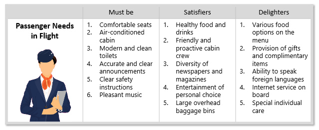
The Kano model is used in this example to analyze customer satisfaction for the economy class in an airline company. The team has brainstormed all possible service features and classified them into the three main Kano groups.
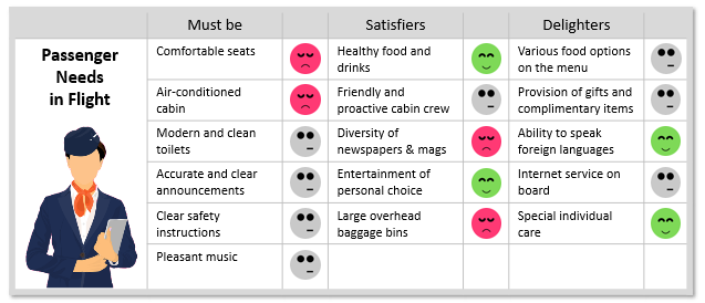
This example illustrates how we can use the Kano model to analyze customer satisfaction for the economy class in an airline company. The team has added the customer information based on previously conducted surveys.
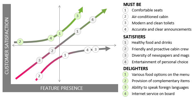
In this example, the numerical values of the satisfaction information were plotted on the Kano diagram.
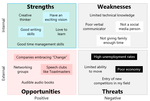
This example uses SWOT analysis to identify and assess a person’s strengths, weaknesses, opportunities and threats.
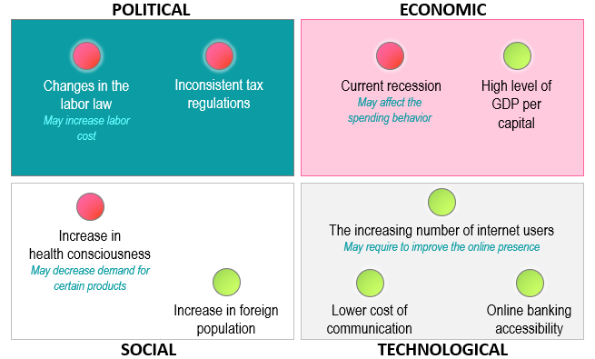
This example uses a four-field matrix to present the outcome of a PEST analysis for an organization.
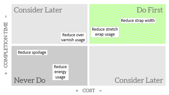
A four-field matrix can be used to prioritize and present the alternatives if you have only two evaluation criteria.
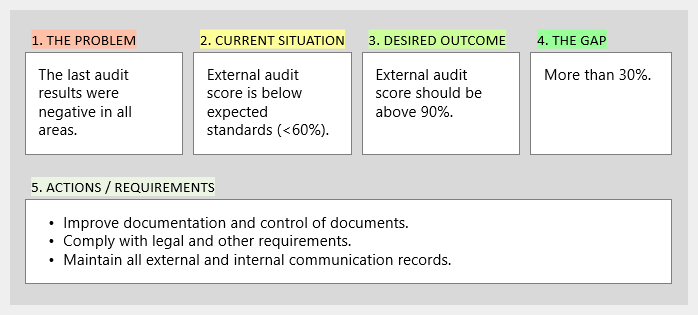
This example illustrates the steps taken to analyze the reasons behind the low audit score after conducting an external audit.
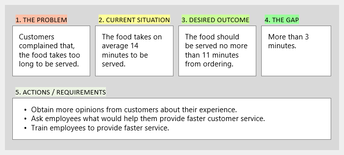
This example illustrates the steps that have been followed to analyze why it takes too long for the food to be served in a restaurant. A fishbone analysis was conducted to identify the causes of the slow service delivery.
This example illustrates the steps that have been followed to analyze why it takes too long for the food to be served in a restaurant. A fishbone analysis was conducted to identify the causes of the slow service delivery.
This example illustrates the steps that have been followed to analyze why it takes too long for the food to be served in a restaurant. A fishbone analysis was conducted to identify the causes of the slow service delivery.
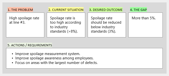
This example illustrates the steps that have been taken to analyze the high spoilage rate at one of the production lines in a factory.
This example illustrates the steps that have been taken to analyze the high spoilage rate at one of the production lines in a factory.
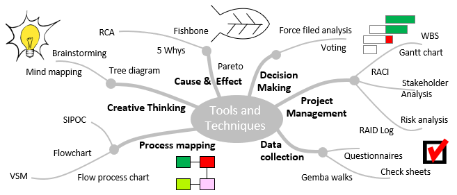
An example of a mind map that was created to help remembering the continuous improvement tools and techniques.
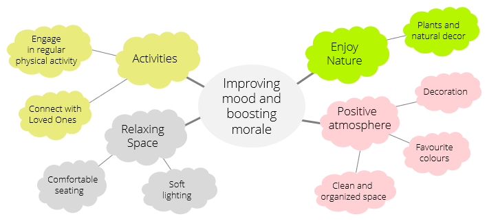
This is a mind map that was created to organize ideas for how to improve mood and boost morale.
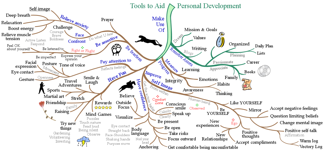
An example of a mind map that was created to help remembering personal development tools and techniques.