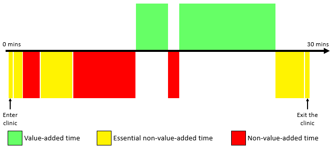
In this example, the patient sequence process in a clinic was analyzed and recorded using the time value map. The process begins when the patient enters the clinic and ends when he/she exits the clinic.
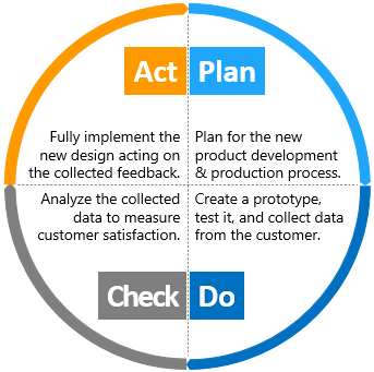
A common example often used to illustrate the PDCA cycle is when a team is initiating a new product development.
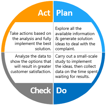
This is an example of a PDCA cycle where a lab team has planned to solve a customer’s complaint about the delayed test results.
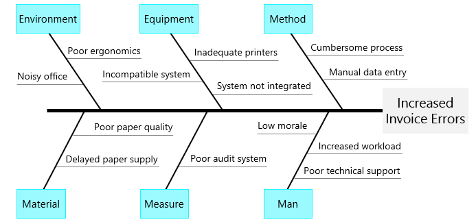
The example shown here is the output of a brainstorming session on the causes of the increased invoice errors for a particular company. Note that this fishbone diagram is labeled with the 6 Ms.
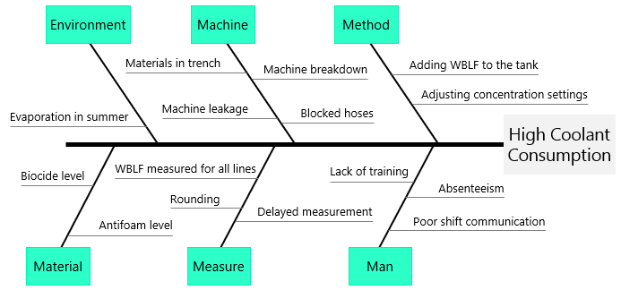
The example shown here is the output of a brainstorming session on causes of the increased coolant consumption in a manufacturing plant. Note that this fishbone diagram is labeled with the 6 Ms.
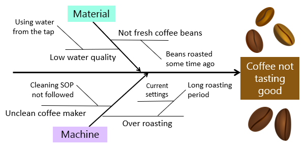
A restaurant manager has noticed an increase in the number of customer complaints regarding the taste of the coffee they make. His team has constructed a fishbone diagram and added the possible causes for only two categories.
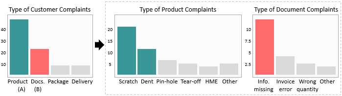
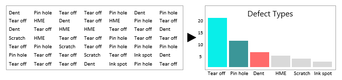
A factory team has collected data to address the rising number of customer complaints. The Pareto chart has further been analyzed and the main categories where specific problems occur most often have been sub-categorized.
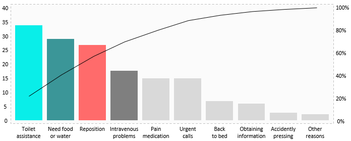
A team in a hospital has collected data to study the increased number of call bell usage by patients in order to improve nursing services.
A factory team has collected data and prepared the following Pareto charts to address the rising number of customer complaints in a way management can understand.
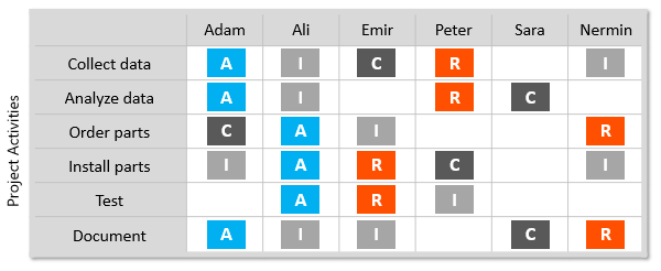
This example illustrates the Responsible, Accountable, Consulted and Informed for a particular project in a manufacturing plant.
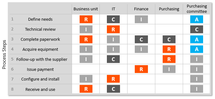
This example illustrates a RACI matrix that has been conducted for the process of acquiring new equipment by a company’s business unit.
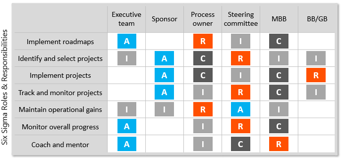
This is an example of a RACI matrix that was created by a management team to help assigning roles and responsibilities for a Six Sigma deployment program.
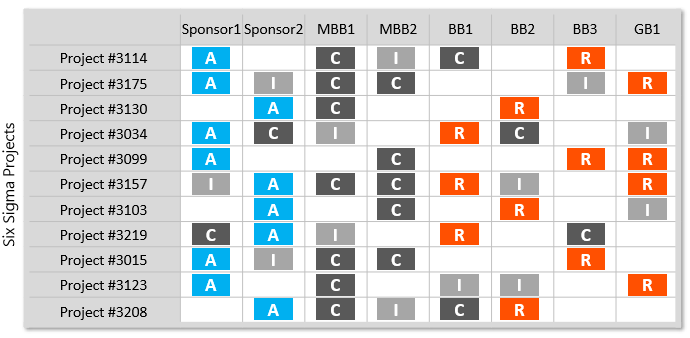
This RACI matrix was created to help assigning the Six Sigma belts to implement improvement projects.
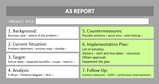
This is an example of a template that can be used to manage your problem solving efforts using the A3 approach.
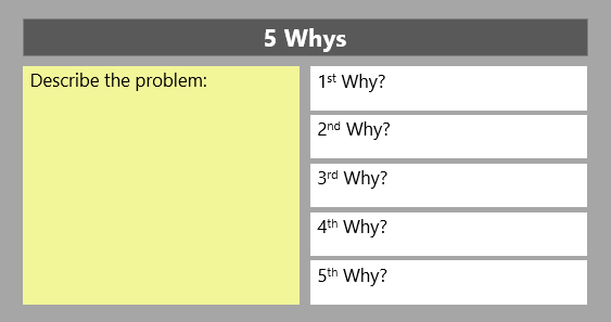
5 Whys can be done in a team setting or on an individual basis. This is an example of a template that you can use to record your 5 Whys analysis.