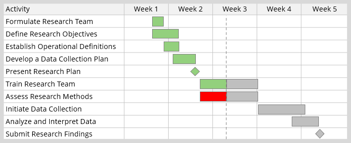
This is an example of a Gantt chart that outlines all activities related to a research project.
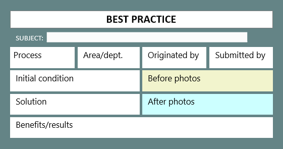
This is an example of a template that can be used to document your best practices before being shared with other teams.
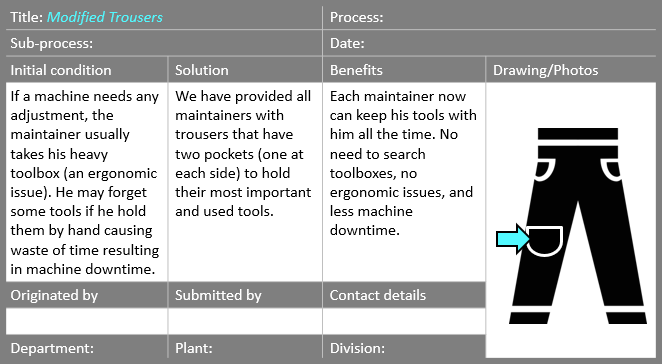
This is a documented best practice that was created by an operator in a manufacturing company.
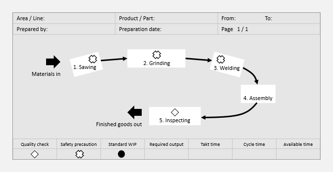
A Standard Work Chart is an example of a visual standard work document. It is used to help with the layout and arrangement of your operation.
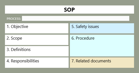
This is an example of a template that can be used to document your standard operating procedure (SOP) for any of your business processes.
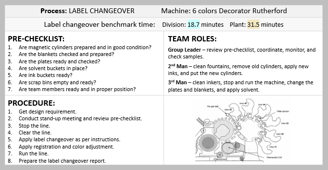
This example illustrates an SOP which was created for the label changeover process in a manufacturing facility.
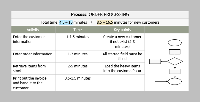
This is an example of an SOP which was created for the order process in a service environment.
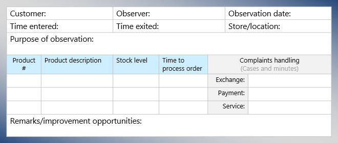
Customer observation forms can be used to truly understand the viewpoint of customers and how they experience your products and services.
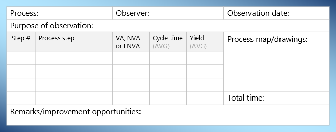
Process observation forms can be used to record the observed data, interview responses, improvement opportunities, and any other useful information.
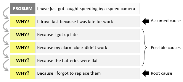
This 5 Whys example is often used during our Lean Six Sigma workshops. Notice the difference between the assumed cause and the root cause.
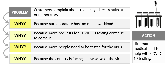
In this example, a team used the 5 Whys approach to determine the reason behind a customer complaint about the delayed test results at a laboratory. Only four Whys were required to get to what looks to be the root cause.
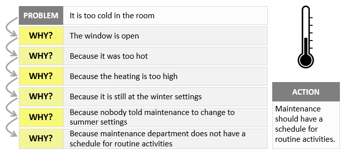
This is an example that uses the 5 Whys approach to answer a concern during a Lean Six Sigma workshop. Note that you can carry on asking Why and ask, “why doesn’t maintenance department have a schedule for routine activities?”.
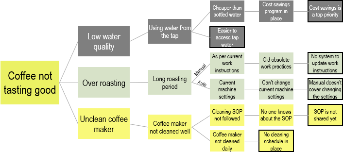
A restaurant team has constructed a why-why diagram to resolve a complaint regarding the increased number of customer complaints about the taste of the coffee they make.
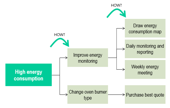
This example illustrates the use of the how-how analysis technique to identify ways to reduce the amount of energy used in a production plant.
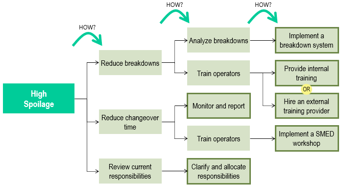
This is an example that illustrates the use of the how-how analysis technique to identify ways to achieve the goal of reducing spoilage in a manufacturing business.