There are different shapes, models and classifications of probability distributions including the ones discussed in the probability distributions article. It is always a good practice to know the distribution of your data before proceeding with your analysis. Once you find the appropriate model, you can then perform your statistical analysis in the right manner. Minitab can be used to find the appropriate probability distribution of your data.
You may use the Individual Distribution Identification in Minitab to confirm that a particular distribution best fits your current data. It allows to easily compare how well your data fit various different distributions.
Let’s look at an example where a hospital is seeking to detect the presence of high glucose levels in patients at admission. For this example, you may use the glucose level worksheet. Remember to copy the data from the Excel worksheet and paste it into the Minitab worksheet.
To find out the probability distribution that best fit the data, select Stat > Quality Tools > Individual Distribution Identification, specify the column of data to analyze, in this case ‘glucose level’, then specify the distribution to check the data against, and then click OK. This will produce the output both in a graph and the session window. Here is a screenshot of the graph if only the normal distribution has been selected.
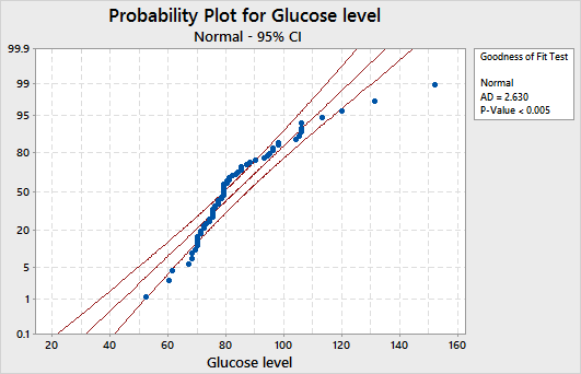
A given distribution is a good fit if the data points approximately follow a straight line and the p-value is greater than 0.05. In our case, the data does not appear to follow a normal distribution as the points are not close to a straight line. You may transform your non-normal data using the Box-Cox or Johnson transformation methods so that it follows a normal distribution. You can then use the transformed data with any analysis that assumes the data follow a normal distribution.
You may also use the Probability Distribution Plots in Minitab to clearly communicate probability distribution information in a way that can be easily understood by non-experts. These plots can be used for example to highlight the effect of changing the distribution parameters or to show where target values fall in a distribution. Select Graph > Probability Distribution Plot, and then choose one of the following options:
- View Single to display a single probability distribution plot.
- Vary Parameters to see how changing parameters will affect the distribution.
- Two Distributions to compare the shape of distribution curves based on different parameters.
- View Probability to see where target values fall in a distribution.
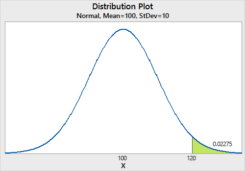
Here is an example of a process with a mean of 100, a standard deviation of 10 and an upper specification limit of 120. The following screenshot shows the shaded area under the curve that is above the upper specification limit.