- Time to Read:
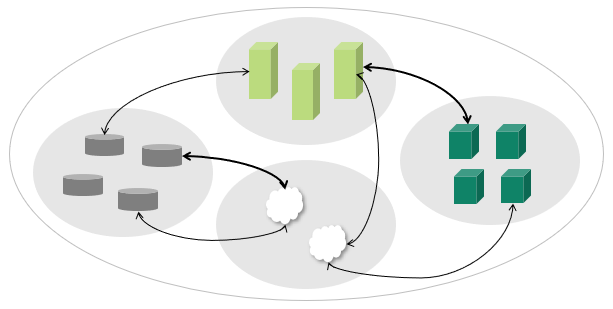
Also known as Matrix Chart and Relationship Matrix.
Related topics include Correlation Matrix, Quality Function Deployment and Cause and Effect Matrix.
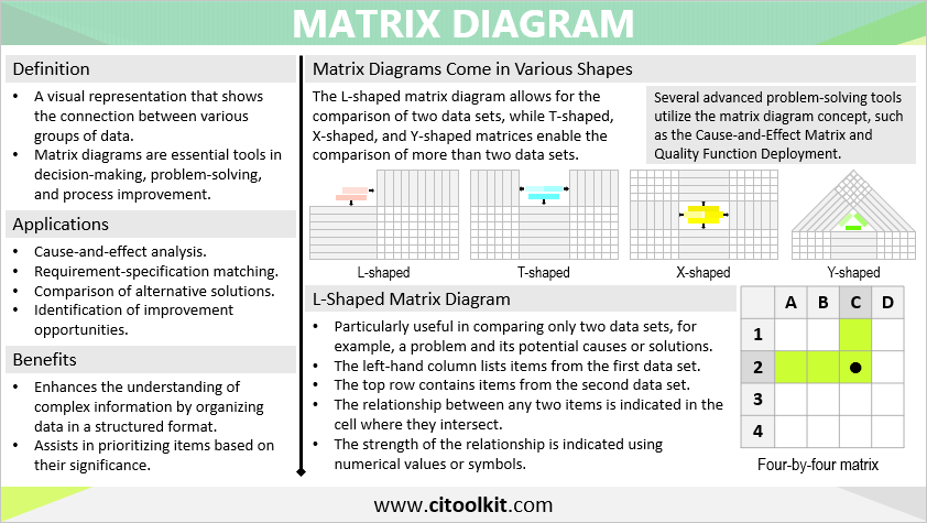
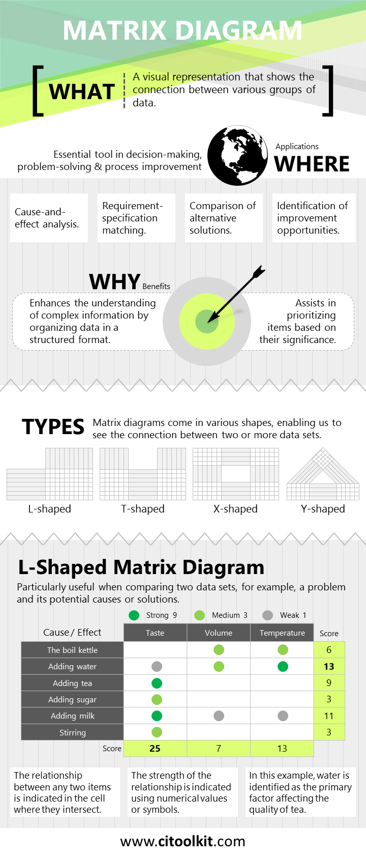
A matrix diagram is a visual representation that shows the connection between various groups of data. It is a planning tool that essentially displays the existence and strength of relationships between pairs of items from two or more data sets. It aims to help in problem-solving, decision making, and process improvement efforts. Several advanced problem-solving tools utilize the matrix diagram concept, such as the Cause-and-Effect Matrix and Quality Function Deployment.
Examples of matrix diagram applications extend across various industries and situations. One of its main applications is in problem-solving scenarios where the relationship between a problem and potential solutions or causes needs to be explored. Additionally, it helps in identifying the measures most strongly linked to customer or business needs. For example, a marketing team may use a matrix diagram to identify and select the most effective sales tools among various options.
Types of Matrix Diagrams
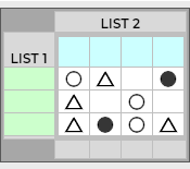
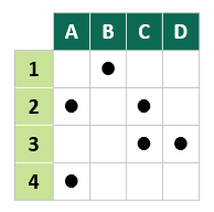
Matrix diagrams come in various shapes with the L-shaped matrix being the most basic and commonly used. This type is often represented as a two-dimensional table, with the left-hand column listing items from the first set, and the top row containing items from the second set. L-shaped matrices are particularly effective for comparing only two lists, for example a problem and its potential solutions or causes.
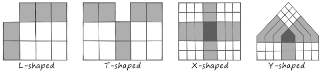
Apart from the L-shaped matrix, other shapes like T-shaped, X-shaped, and Y-shaped matrices allow the comparison of more than two lists.
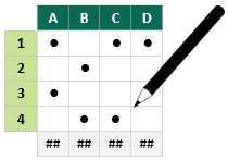
In a matrix diagram, the relationship between any two items is indicated in the cell where they intersect. At each intersection point, the relationship is either present or absent. When it is present, the strength of the relationship can be indicated using numerical values or symbols placed at the intersection point. A scale from 1 to 5 can be used where 1 indicates a weak relationship and 5 indicates a strong relationship.
Symbols are preferred over numbers as they enhance clarity and simplify interpretation. Each symbol corresponds to a specific numerical value or level of strength, such as weak, moderate, and strong.
Weighting can be applied in the matrix diagram to assign relative importance to specific items within the data sets. Additional information can also be displayed, including weighted scores, ranks, and the overall relationship strength score. These weighted scores can later be considered to identify, prioritize, and select the most favorable options.
Constructing and Using a Matrix Diagram
The following steps describe how to construct and use an L-shaped matrix diagram:
- In your team, clearly explain the purpose for building the matrix diagram.
- Select and collect the two sets of data to be compared.
- Agree on symbols and their values.
- Draw a two-dimensional table on a flipchart or table.
- Insert the first data set in the left-hand column and the second data set in the top row.
- Assign weighted scores to show relative importance of items.
- Work through the matrix and discuss the relationships between every pair of items placing the appropriate symbol in the intersecting cell.
- Calculate the final weighted scores for each item in either or both data sets.
- Review the completed matrix with the team to make informed decisions.
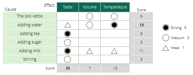
Example – Making a Better Cup of Tea
The following is an example of an L-shaped matrix diagram constructed by a coffee shop team. It illustrates the cause-and-effect relationship to enhance the quality and flavor of the tea they provide.
Example – Assigning Human Resources to Multiple Projects
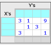
A program manager decided to use a matrix diagram to help allocate human resources to multiple improvement projects. This is an example of a T-shaped matrix diagram that enables the comparison of two sets of data with a third one.
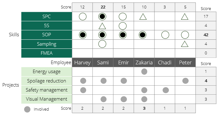
For example, it is important for those working on the spoilage reduction project to have basic knowledge of statistical process control (SPC).
Example – Application of Improvement Tools
The example below illustrates the workshops attended or conducted by each department in an organization during a change management process.
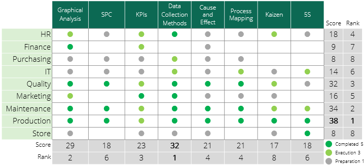
Note that high scores in columns suggest workshops in their final stages, while high scores in rows suggest departments with significant progress.
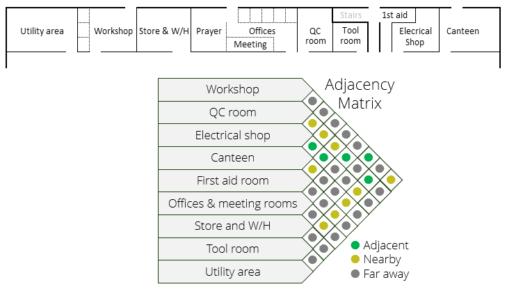
Example – Correlation Matrix
It is also possible to compare the same items together by using a triangular half-matrix called the correlation matrix. For example, the following adjacency matrix is created in a facility to analyze and reorganize rooms and areas in a way that supports workflow efficiency and enhances teams’ collaboration.
There are many tools available to help in creating matrix diagrams. One of the simplest and most straightforward methods is to use these matrix diagram templates.
Wrapping Up
A matrix diagram is one of the seven management and planning tools that are important for making confident and rational decisions. Matrix diagrams are essential tools in decision-making, problem-solving, and process improvement. The application of matrix diagrams extends to various situations, including cause-and-effect analysis, requirement-specification matching, comparison of alternative solutions, and identification of improvement opportunities.
References
Heizer, J., Render, P., & Al-Zu’bi, Z. Operations Management.
Kubiak, T. M. The Certified Six Sigma Master Black Belt. Infotech.
Other Formats
Slides
Poster
Infographic
Do you want to use the slides in your training courses?
Matrix Diagram Training Material: $15.85
Related Articles


Related Templates