
Minitab is a statistical software that allows you to enter your data to perform a wide range of statistical analyses on that data. It can be used to calculate many types of descriptive statistics including the ones discussed in the Descriptive Statistics article which can tell you a lot about your data in order to make more rational decisions. Descriptive statistics summaries in Minitab can be either quantitative or visual.
Let us look at an example where a hospital is seeking to detect the presence of high glucose levels in patients at admission. For this example, you may use the glucose level worksheet. Remember to copy the data from the Excel worksheet and paste it into the Minitab worksheet.
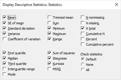
Now that we have a data set, let us find out a bit more about it. To create a quantitative summary of your data, select Stat > Basic Statistics > Display Descriptive Statistics, and then select the variable to be analyzed, in this case ‘glucose level’, and then click OK. Below is a screenshot of the various descriptive statistics you may choose when doing your analysis.
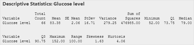
Here is a screenshot of the example result:
Graphical Summary is another way to explore your data. To create a visual summary of your data, select Stat > Basic Statistics > Graphical Summary, and then select the variable to be analyzed, in this case ‘glucose level’, and then click OK. Here is a screenshot of the example result:
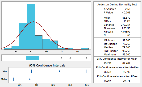
The graphical summary can help reveal unusual observations in your data that should be investigated before you perform a more sophisticated statistical analysis. By default, Minitab fits a normal distribution curve to the histogram. A box plot will also be shown under the histogram to display the four quartiles of the data. The 95% confidence intervals are also shown to illustrate where the mean and median of the population lie.
The mean, standard deviation, sample size, and other descriptive statistic values are shown in the adjacent data table. The skewed distribution in this example shows the differences that can occur between the mean and median. The mean is pulled to the right by the high value outliers. The positive value for skewness indicates a positive skew of the data set.
The Anderson-Darling Normality Test assesses how normally distributed the data set is. The p-value which is much lower than the significance level of (0.05) indicates that the distribution is not normally distributed. Note that there are other ways to assess the normality of the data.


