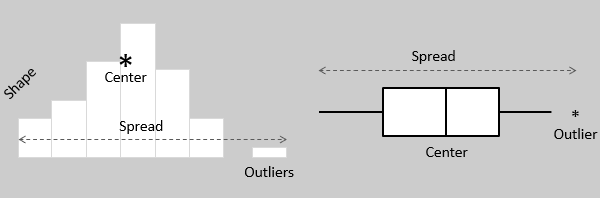
Both histograms and boxplots allow to visually assess the central tendency, the amount of variation in the data as well as the presence of gaps, outliers or unusual data points.
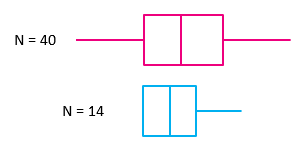
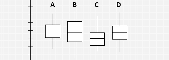
Box plots are ideal to represent moderate to large amount of data. The size of the box plot can vary significantly if the data size is small.
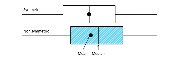
Box plots can tell if the distribution is symmetrical or skewed. In a symmetric distribution, the mean and median are nearly the same, and the two whiskers has almost the same length.
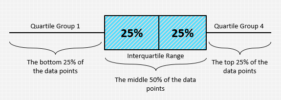
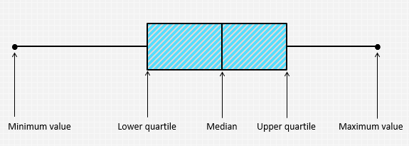
The data is plotted in a box plot in such a way that the bottom 25% and the top 25% of the data points are represented by the two whiskers, whereas the middle 50% of the data points are represented by the box.
A box plot may show key statistics such as the median of the data, maximum and minimum values, as well as the lower and upper quartiles.
Box plots are most useful when comparing between several data sets. They allow you to compare the central tendency as well as the variability of multiple data sets.
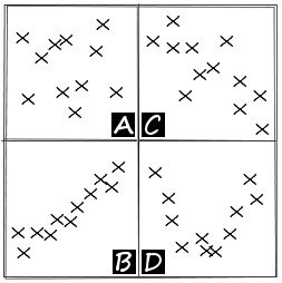
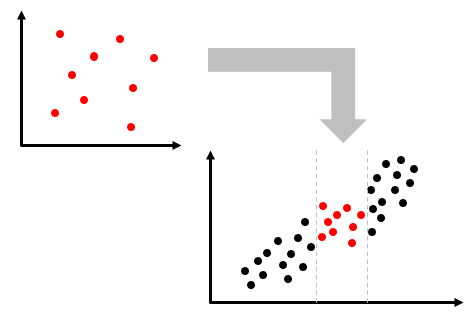
Scatter diagrams can indicate several types of correlation.
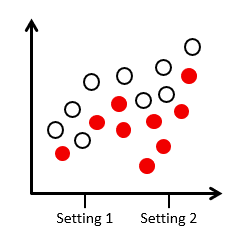
You can indicate a stratification factor in the scatter diagram.
No correlation does not mean there is no cause-and-effect relationship. There might be a relationship over a wider range of data.
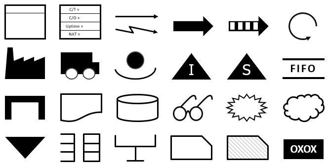
Value stream mapping uses a set of symbols to denote the various details. These are the basic symbols that are applicable in most situations.
In a value stream map, the information flow is commonly placed at the top, material flow at the middle, and the VSM timeline are placed at the bottom of the map.
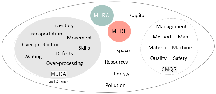
There are many classifications of waste. One of the most basic and widely used models across many industries is the Eight Wastes.
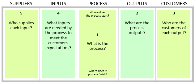
A SIPOC map can be created quickly by drawing a table of five columns. These five steps describe how to create a SIPOC map with your team.
These questions can be useful to complete the SIPOC analysis exercise with your team.
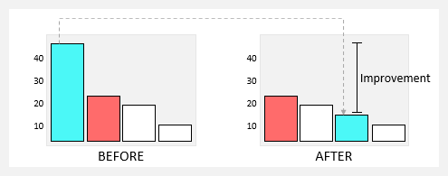
The Pareto principle serves as a useful framework for assessing the impact of improvements by comparing the before and after states. Analyzing the new Pareto chart allows for the confirmation of the achieved improvement.