Continuous Improvement Toolkit
Effective
Tools
for Business and Life!
Search
Libraries
Articles
Templates
Slides
Posters
Infographics
Examples
Exercises
Maps
CI Map
Lean Tools Guide
Yellow Belt Guide
Green Belt Guide
Black Belt Guide
PMBOK Tools
Change Tools
DMAIC Process Guide
Basic Quality Tools
Blog
Shop
Tag:
frequency
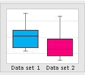
Box Plot Template
The Role of Box Plots in Comparing Multiple Data Sets
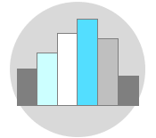
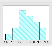
The Role of Histograms in Exploring Data Insights
Histogram Template
Graphical Analysis
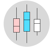
Exploring Histograms and Box Plots: Similarities and Differences
Pareto Analysis: Identifying the Vital Few from the Trivial Many